


The way an artist incorporates color into their crochet project is integral part of every crocheter’s signature style.From dark and vivid shades to more subdued pastels, adding a hint of color to your project is going to go a long way in adding fun and visual interest.
While you may be familiar with common color combinations, it’s only a matter of time before you start staring at your yarn collection trying to decipher which colors and types of yarn work best together. To come up with color matches and create complementary patterns, crocheters often turn to color theory.
Creating Yarn Color Combinations with Color Wheel
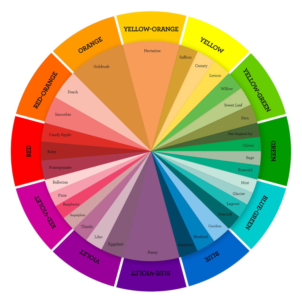
You may recognize the color wheel as one you possibly learned in school or came across in another way. By looking at the diagram from different angles and directions, you can match two colors that perfectly complement each other. But before you take a closer look at the color wheel, let’s get you familiar with the types of colors: primary, secondary, and tertiary. We can even break these down further in a more professional way of talking about color.
Defining a Color in Color Theory
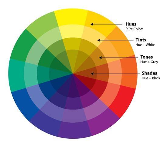
Color-is a general term that is used to describe everything thing no matter what kind of color it is. When using the word color you are describing every tint, tone, shade or hue you see. White, black and grey are even referred to asa color. These ideas are the basic definitions you'll need to define color combinations.
Defining a Hue
Hue- Hue is the term for the dominate color family you see. These are any primary or secondary color or combination of a pure color. For instance if you wanted to make a blanket with one color family you would be picking one single hue to work with. As an example maybe you are looking for colors in the hue of blue, and will be using several different blues, but either the blanket will be in a hue of blue. Understanding the use of the word hue is even more important when describing neutrals. Browns, greys, and whites can lean towards any color and being able to identify the underlying color helps when choosing color options. It’s important to note that hues are pure colors that don’t contain any black, grey or white.
The primary colors are red, blue, and yellow.These are colors that cannot be created by mixing two shades together.Secondary colors, on the other hand, can be created by mixing two primary colors together, such as red and yellow to make orange, red and blue to make purple, and blue and yellow to make green.
Tertiary colors are a mix of primary and secondary colors. For example, the primary color yellow mixed with the secondary color green can make an entirely new shade, lime green. In this case you would describe it by hue as well, but you would incorporate the second hue. For instance lime green would be described as a yellow and green hue. In this case neither yellow or green is dominate, however, we tend to list the primary color before the secondary color, some people prefer to list the more visually dominate color first, either way is appropriate and acceptable.
Defining a Tint
Tint- Tint is something that we often describe as a pastel. Color theory defines a tint as white mixed with any hue or mixture of pure color. A tint lightens the color when painting or mixing colors you would add the color white. When we are speaking of dying yarns we are suspending less pigment into the fibers.
It’s important to note that a tint contains no grey, this becomes more complex when you aren’t sure what is in your base color. Pigmented color is really strong, so if you are making a pastel, start with your white then slowly add your pure color. If you are looking to give your pure color a bit of luminescence and depth of color often an artist will add a touch of white to the pure color.
If you mix paint for and have a base color that isn’t pure meaning it might have grey in it your tint may become muddy instead of a lighter version of your primary or secondary color. You may also see a this happen if your white has a hue to it. If you are mixing paint use a nice titanium or titan white, these are free of additional pigments. If you are mixing commercial interior or exterior paint, it’s best to leave the paint mixing to the specially trained professionals where you purchased the paint. In commercial interior and exterior paint the bases change often and so do the colors that are able to be produced. If you ever watch what colors they add to their bases before they shake up the paint it’s pretty amazing, and definitely a big thing on TikTok.
Defining a Tone
Tone-Tone is similar to tint but instead of mixing white with a pure color you are mixing grey. When mixing grey with the pure color it tones down the intensity of the color especially when you add a neutral grey to the mix. You’ll see a lot of tones in our Mellowspun Yarn line, although you’ll find some hues and tints as well. Tones are wonderful colors and most people gravitate towards them as they are very pleasing to the eye. Generally speaking almost every color we see in our day to day life is a tone, that’s also why when you go and see commercial paint mixed you’ll see grey added.
Complementary Colors
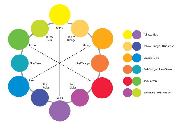
Complementary colors are those that sit across or opposite each other in the color wheel. While they are strong contrasts with each other, that’s precisely what makes them go well together. The complementary colors are:
- Yellow and violet
- Yellow-orange and blue-violet
- Orange and blue
- Red-orange and blue-green
- Red and green
- Red-violet and yellow-green
The different shades of these complementary colors also go well together. For example, you can use a softer, more muted shade of red to pair with a pistachio green for a more pastel palette. Use complementary colors in ripples similar to the suggestion in analogous colors but this time watch how the colors play with each other and ultimately balance each other out, you’ll notice how your eye stops every time there is a color change. This is a great way to play with color blocking in your design too.
Double-Complementary Combination
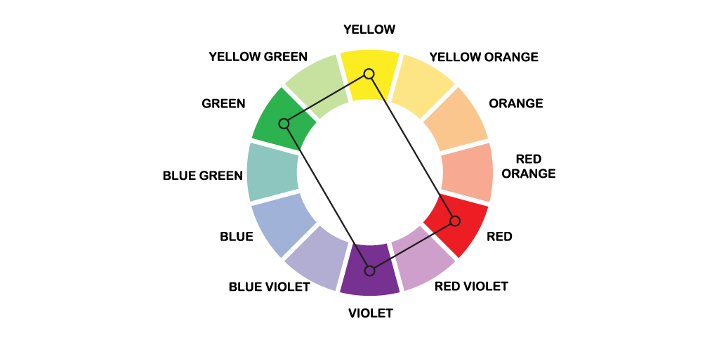
The double-complementary combination, also called the tetrad, uses four complementary colors sitting opposite each other in the wheel. To get double-complementary colors, you start by picking one color, skipping the one next to it, then choosing the one that follows. Then, you go across the wheel and do the same to yield two pairs of colors.
Because the tetrad uses four colors and is often a mix of warm and cold shades, it’s easy to go wrong with it. Use this combination with caution – we suggest changing one or two colors with a more neutral shade where possible, like white or grey instead of blue and cream or beige instead of orange. This is a great way to choose colors for granny squares or any time you are working blocks of seamed together. Throw in a nice neutral color like white, grey, or tan and watch the colors pop!
Triadic Combination
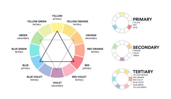
Another way that you can look at the colorwheel is triadically, or by finding colors that are equidistant in the colorwheel. This will give you three shades that are very different from each other, but when used correctly, create harmonious and vibrant pieces that stand out. We often use this technique when we are choosing colors for ensembles.
Split-Complementary Combination
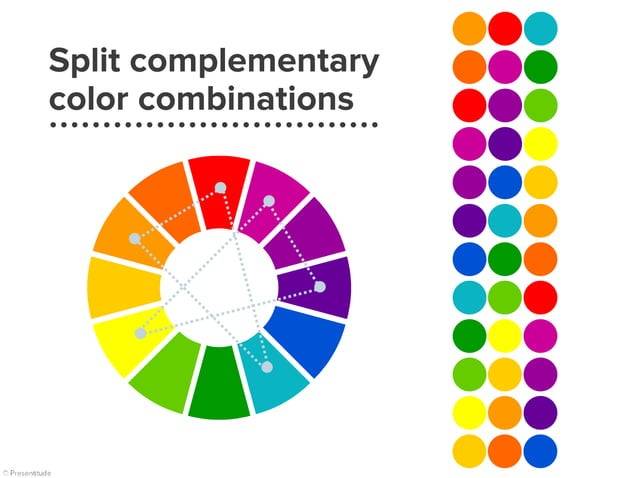
A split complementary combination is created the same way you would identify complementary colors in the wheel, except with one side-splitting between two colors. This gives you a superior color that pairs well with two shades that are more similar to each other. The result is a less contrasting mixture that looks great in a crochet project. Can you see a resemblance to any colors in our Prism Yarn?
Saturation and Brightness
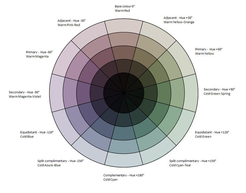
Looking at the color wheel, you’ll see a range of bright and saturated colors. But before you worry about how your project will look with them, make sure you’re considering other hues that come from adjusting the colors in the wheel. The color wheel doesn’t just encompass bright red or bright green. It also includes darker burgundies, maroons, limes, and olives.
You can adjust the colors by playing around with saturation and brightness also known as tint, tone, and shade. The former involves changing the color’s pureness. More saturation equals a brighter color. So if you want a more neutral tone, you can go two or three saturations less.
How Do You Find the Best Color Combination and Inspiration?
Relying on the color wheel is a good starting point for choosing the best colors to match your crochet project. But if you need further inspiration, there are other mediums you can look at.
Check Pinterest
Pinterest is a kin to heaven for those intocrafts like knitting and crocheting. Think of it as your peg board where youcan find several completed projects you can get ideas from.
You can also use it to find complementary color combinations by searching for color palettes that align with your vision. For example, a Pinterest search of “winter color palettes” will show you scales of blue and white, while a “pastel color palette” query will give you swatches of pastel color combinations.
Try Online Color Palette Generators
There are various websites you can take advantage of to generate good color combinations. Coolors.co, for example, lets you find colorpalettes on demand and lock colors that you want to include in your project. It also lets you play around with different tints and shades to give you moreoptions.
Experiment with Swatching
If you have a yarn collection and want to seehow the different colors work together, you can experiment with swatches.Simply crochet a couple of rows with one color, switch to another color, and soon. Feel free to make as many swatches as you need to find the perfect color matches. When you swatch you can also see how the light bounces around andaffects color.
Don't Forget About Neutral Colors and Nature!
The biggest source of inspiration you will find is all around you. Nature is abundant with earthy colors, from the lush green trees and deep brown soil to the faint blue sky and turquoise waters. The colors of nature never fail to look great in crochet projects, especially when mixed with neutral colors like white, gray, cream, or black.
So take a moment to look around you and identify the colors of nature that resonate with you the most.
Trust Your Instincts!
Ultimately, the best colors are those that you love. When choosing tones for your project, utilize the color wheel to get started and then trust your instincts to adjust them accordingly. Sometimes, you may need to add a third color to balance everything out. Other times, you should remove color for more simplicity.
Whatever the case, trust what your gut is telling you. Crocheting is about unleashing your personal creativity – so don’t let yourself be bound by too many rules and let your unique ideas shine.